No More Mistakes With Global Web Design
Imagine you have access to a website. What do you pay attention to first? If you are somehow aware of the global trends for web design, you’ll surely answer web design.
Probably web design provides all the answers to your concerns. Web design is a form of art. It is the service that gives an appearance to any website and supplies its functionality, making it easy to use, enjoyable, and easily navigable.
If you have never paid attention to the importance of website design, then it’s the right time for you to change your attitude. Today the global web design is a very challenging point. If your website lacks it, you are likely to lose a significant number of your site visitors while an appropriate design has a good influence on your website quality.

To avoid such a bad scene, you are highly recommended to get familiar with the website design dos and don’ts. Follow my guide on how to find your mistakes and leave them out because you don’t want messy website users immediately leave. Come on!
What are the global web design mistakes?
Never confuse local design with the global one. If you hesitate about choosing local vs global, choose the one which best fits your business needs. However, the global net is so actively expanding its trends that you won’t see any difference soon in the near future. In any case, you need to be aware of what mistakes you can avoid in the global website design.
№ 1 Confusing website look
Have you ever entered a website and felt confused? Some sites don’t provide a clear look for the users. Similar platforms aren’t navigable. The overall look of your website should be easily understandable for your users. They should immediately get how they can receive the information they need or any other action on your site.

Make your website appearance related to your business. The colors, the logo, and similar points should be as close to your brand as possible. Pay attention to the color scheme to make sure that every tone is perfectly chosen and is pleasant to the eye.
Use a single logo that evokes emotions to your product or service. Some websites present different logos on different pages of their website. Search logo design and choose the one that best visualizes your brand. Don’t confuse the visitors.
Remember that users don’t like to make an effort. You should minimize the clicks and maximize the opportunity so that they get the required date with the least possible clicks.
Need some help to clear your website?
№ 2 Poor content
Your website content is really important. First of all, every single sentence should be related to your message and speak about the benefits your visitors may get. If you are sure about it, then think about the look of your content.
Imagine that visitors don’t read every single word on your page but scan the whole page immediately. Write your texts so that they are easily readable. Use different shrifts and styles to make a differentiation. Increase the size of the headings, write important points in a larger size to be sure visitors won’t miss anything important. Yet, don’t introduce too many styles on one page.

Also, assure that your site includes some blank space. If the web page is full of the content without any white space, the readers don’t feel like reading of getting any meaning. The overdone page frightens your visitors. However, find the golden middle. Nor underdo your page with a lack of content.
Pay specific attention to visual content as they speak and attract better than the words. Include some photos that are related to your content and transmit your business messages. Make sure your images have high quality. Yet, do not forget to consider the image optimization. It increases your site speed and doesn’t make your visitors wait.
№ 3 Unclear CTA
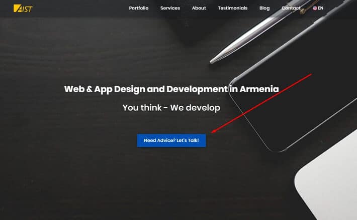
Do you have any CTA buttons on your website? These are Call To Action buttons that prompt your users to make any specific action on your page. Make sure your CTA buttons are short and concise. At the same time, they should clearly direct your site visitors.
Be clear and tell exactly what the reader should do. Help your users without annoying them. Tell them “what to do”, “where to go”, or “how to feel”, as:
✔ Click here
✔ Get started
✔ Contact us now
✔ Add to card
✔ Log in/Sign up

№ 4 Lack of contact info
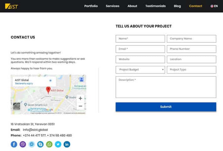
Your contact information is the only way the potential customers may get in touch with you. Ensure that you provide appropriate details in this regard in order not to miss your opportunity. It’s also nice to have some detailed information about your company and service. It helps the reader to understand whether they really need your service/product or not.
On some websites, you may experience the “About” and “Contact” data on the same page. However, it’s better to differentiate them not to confuse the visitors. Many people don’t expect to find the contact information on the “About” page.
And the most important point, assure that you provide precise information and both your email address and telephone number are accurate. Some pages don’t provide their email address; instead, they let the visitors fill in a “contact us” form. Yet, it’s not the right choice as it prevents many people from writing to you.

However, if you chose to provide just a “contact us” form, make sure it works. I’ve much experienced the website error when I feel in but the message isn’t sent. In this regard, check and be sure about your quality assurance.
№ 5 Irrelevant ads
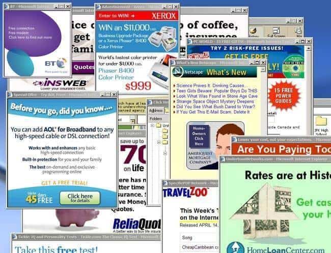
Today the Internet is full of advertisements. You may also like to host online advertising campaigns on your site. These are display ads that appear on your website pages when the users access.
Yet, there should be a limit to these ads. Some websites just overdo with ads and damage their look of global innovative design. You enter the page and… Ads appear everywhere and prevent you from getting the main content of the web page.

Pay attention to the pop-ups as well. Make sure that the visitors get an opportunity to close them whenever they appear on their screens.
№ 6 Not mobile-friendly design
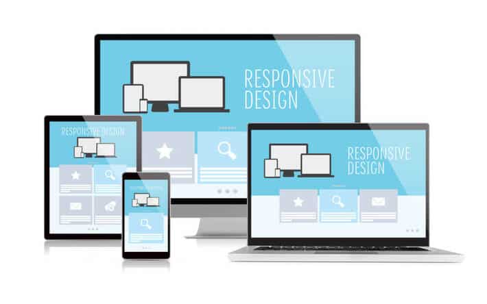
The global website design trends are changing very fast. I won’t uncover a secret if I tell that people search on the net by various technological devices, including full-screen computers, laptops, tablets, and smartphones.
The primarily used device is probably telephone because it’s what people have with them everywhere at home, during a journey, at work, on the way, etc. Surely, you don’t want to disappoint your visitors who use mobiles. Your website must be mobile-friendly otherwise, all the points mentioned above don’t make sense.
Imagine you have a website that looks perfect on the full-screen while your potential customer clicks on your website link and what a surprise… It’s a messy platform that doesn’t make any sense, and the visitors immediately leave.

Surely, you have never dreamed about such a platform. So, make your website a mobile-friendly platform that looks great both on a full-screen and on mobile. Don’t disappoint your users.
To Sum Up
Now you are aware of the most serious mistakes with global web design. If you avoid all of these website blunders you may be glad you make the platform friendly for the users. Your website is the online face of your brand, so it has no other chance than be perfect.
If you still have some questions related to the topic or you tend to remove all the misunderstandings on your site, feel free to get in touch with us. Need help?

Հեղինակ ՝
Vera Mirzoyan
Հրապարակվել է ՝
Օգոստոս 14, 2019
Թարմացվել է ՝
Դեկտեմբեր 29, 2020


