
5 Best Landing Page Design Ideas That Will Inspire You
Have you ever thought about what your users pay attention to when they appear on your website? Do you highlight the quality of your page? If you do, then you are in the right place, go further.
First of all, let’s clarify what a landing page is. It’s the page your visitors appear in when they enter your website URL. Whether people we’ll stay on your page and make further actions or leave your site with a single click depends on your web landing page design and content. Here we come to the point:
What are the trends of landing page design that the users trust?
The first impression your site has on its guest decides whether they stay in or leave out. So, you have no chance but to create such an attractive web page that engages even the most complicated user. But how you can design a landing page that’s effective enough to convert visitors and get them to act. Let’s discuss some tips for creating a useful landing page:
1. Sensible Content
The content on your page should be to the point. It should be clear, direct, and highlight your unique value. There are some essential points you must include a:
✔ Heading - It’s the first text that your visitors read. Leave it as attractive and straightforward as possible. People don’t like to give an effort to think much. Make it simple and easy to immediately understand what’s being offered.
✔ Subheading - Subheading is what’s used to explain the offer further and highlight your value.
✔ CTA - A CTA (Call To Action) button encourages your visitors to do the last click you for which work.
These three points are also components of landing page SEO, and they should correspond to each other. The subheading must provide additional information about your offer and, what’s most important, it should highlight the benefit your readers get. In my example, you can see how the points complement each other.

Let’s create a similar landing page for you!
2. Appropriate Visuals
A picture worth thousands of words, a video - even more. You are highly recommended to include photos and videos on your page. However, make sure that these elements correspond to your content and help your audience get the message you try to transmit more quickly. Pay attention to the high quality of the shots that shows the best sides of your product or service.
3. Responsive Design
A responsive landing page has a better chance to work on behalf of your business. Today people are connected to their mobiles everywhere, and a mobile landing page is a must for every website. The responsive design of your landing page helps to increase your conversation rate.
4. Social Sharing
Encourage people to share your website on their social media by including social sharing icons.

5. Influence on people’s emotions
People positively response to emotional cues that encourage them to click. The most effective ways, in this regard, are to arouse fear, evoke laughter, amuse, excite joy, surprise, evoke anger, and even more.
6. UI Design
Your landing page UI design includes all the buttons, controls, colors, and other elements on your page. This is an innovative website design trend that guides your audience through the page. An example of clear UI is that CTA buttons usually have a different color so that they are visible, yet they change the color when one clicks.
7. A/B Testing
Once you have a clear landing page, you may perform an A/B Testing to decide whether your page works efficiently or not. You may conduct testing on the following fields:
✔ Headings
✔ CTAs
✔ Button texts and locations
✔ Images
✔ Placements of different elements on the page.
Now that you are somehow familiar with the most important tips on landing page best practices, you should check out several landing page examples below. Surely, you’ll get some inspiration for your own page design ideas.
#1 Moz Pro

The Moz Pro landing page is excellent because it’s clear, concise, and practical. The heading and subheading briefly include the benefits one may get and immediately offers a free trial by a CTA. The colors and placements of the elements are so clearly chosen that the audience may navigate the page without making a great deal of effort.
#2 Duolingo
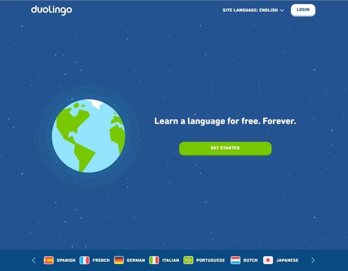
Duolingo is another clearly created landing page. The page immediately tells the audience what to do and why. The page is easy to navigate and understand due to a clean and straightforward UI. And whenever one tries to click on the CTA button, it’s color is converted into the lighter green.
#3 Flickr
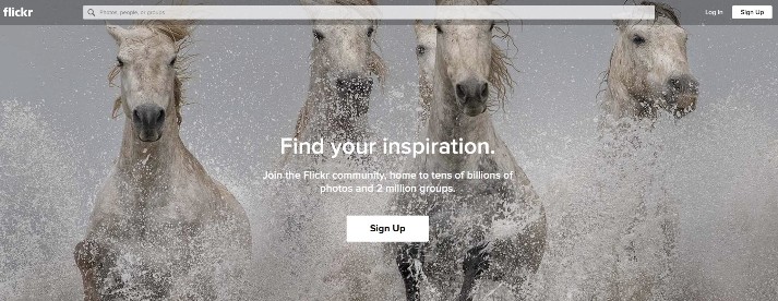
There isn’t anything surprising about the text content on Flickr. The heading and subheading show what to expect from this web page. However, this landing page puts the focus on visual content. The background image is changed every few seconds and attracts the attention of the audience.
#4 Upwork
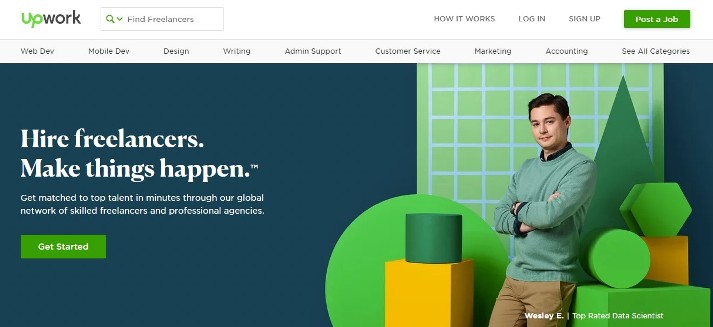
The simple landing page of Upwork expresses their service and mission on behalf of the reader. Their heading, body, and CTA are created in a way that makes the visitors easily scan the page and make the expected action.
#5 Fabfitfun
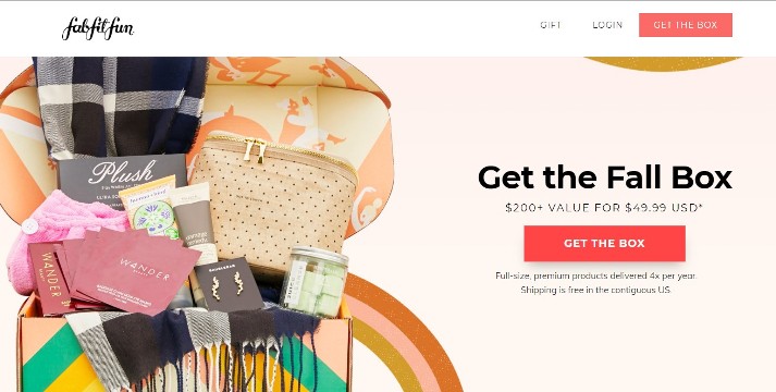
Fabfitfun has an interesting e-commerce landing page. It offers unique value and prompts the visitors to click at the CTA button to make purchases.
Summing Up
The landing page is like a business offer. We may say that every website has a landing page marketing mission. People are convinced to make the action only on the most impressive and awesome landing pages.
Make yours one of them!

Հեղինակ ՝
Vera Mirzoyan
Հրապարակվել է ՝
Սեպտեմբեր 10, 2019
Թարմացվել է ՝
Դեկտեմբեր 29, 2020


