
Modern Website Design in 2021
From time to time, we come across websites that draw us in. This is mainly thanks to the attractive website design. Along with the time, all the design trends, as well as the audience expectations, change. Accordingly, businesses tend to adapt their site design or start their new website development, following the upcoming and modern website trends.
Below, you will find all the details and points, that worth consideration and will help you go along with the flow. First of all, let’s shape a clear image of why website design is important in 2021.
The Importance of Modern Website Design in 2021
What do you pay attention to first when you land on a website? About 95% of the average users’ attention goes to web design. This is a critical reason to take care of it and provide an appearance that will attract visitors and prompt them to further in-site actions.
Once your “modern web design” doesn’t meet the users’ belief, some unpleasant situations may come forward, such as:
- increasing bounce rate (potential audience appear on your landing page and immediately leave it because of the bad design),
- unjustified marketing plan (the improper design may mislead your potential customers so that you don’t achieve your marketing plan goals),
- disappointed customer feedback,
- unproperly performing business,
- decreasing business revenue.
I’m sure you don’t have such a nasty expectation about your business future. So, you should do your best to avoid website design mistakes and accordingly, similar undesirable situations. Below in this article, I’m going to present all the modern web design trends. It will help you to get to the right point to redesign or start new website designs, following standards.
Web Design Trends in 2021
Being highly aware of the fastly changing technological world, web development companies are responsible for providing qualified services and interactive websites that meet business needs. Having a proven experience in the field, AIST Global always considers what is coming to us. Accordingly, here you are provided with solutions that are good choices not only for today but are also promising for the future. Let’s check out what will be the modern website design trends in 2021.
#1 Dark Mode
As a user, I use dark mode in all the available platforms and applications. I even change my mobile phone theme to dark. Surely, there are many people who do the same because the dark color is pleasant to the human eye and not tiring. We are used to platforms and mainly, applications that have an option to change to the dark mode. Such applications are for instance YouTube (website and app), Facebook (website and iOS app), etc. Some applications become dark when we use the dark theme from phone settings, such as Instagram.
This trend becomes very popular and developers started thinking about creating such a function that gives the users an opportunity to go on dark mode. Some businesses have already used this trend. Estudio/nk is an example of such a website.
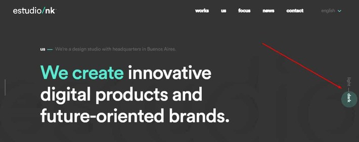
As you may see in the above-attached photo, there are clickable points on the right side to switch to either dark or light mode. The initial theme of the landing page design is dark. Others just prefer to choose dark colors for the page background. However, what we believe in, is that dark mode is going to gain more attention in the future.
#2 Mobile-First Design
I won’t open a secret saying that these days the world is going mobile. People prefer to take action through mobile phones rather than widescreen computers or laptops. Mobile-first design is one of the trends that were highly discussed for a few years. However, this is a growing trend and is going to gain a lot more attention in 2021 as well.
Until now, we consider one thing - the website should be mobile-friendly or responsive. This means that a web page is developed having a widescreen version in mind. Then this version is adapted for the mobile screens. In the upcoming year, however, this is going to be changed. The mobile view comes to the first place, as the number of users who prefer mobile solely or first is constantly growing. And this isn’t all.

According to Google, the preference for website indexation is mobile-first indexing. It is said that as a rule, the mobile version of digital content is used by the engine for indexation and ranking. From here we understand that these platforms that utilize the mobile-first design strategy, tend to have a higher position in the search engine result pages. So, when potential users search for services or products you offer on your platform, it has a higher chance to appear. Accordingly, the mobile-first indexation becomes an important point of SEO.
On the other hand, mobile-first design is a great factor of high UX. This strategy pretends using images that have a good look on mobile screens. Yet, there is a higher chance to present more specific and to the point content, because of the space shortage. As for the users, thanks to it. Users are lazy about reading long content.
#3 Live Chat and Chatbots
There was a time when it was enough to find the business email or contact form to communicate with the website owner or editor. Today, people avoid sending emails as there is a great chance it doesn’t reach the required person. Besides, there are various platforms and little time. So, users need quick responses to have their questions answered. Live chats are good solutions to this problem. In case of a concern, the user writes on the live chat and the support team members immediately get in touch to offer an explanation or a quick fix.
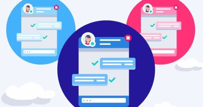
In some cases, these live chats are connected to chatbots. When the users want to get in touch, some questions appear. If they have one of the offered questions, they may immediately click on it and avoid typing. The answer comes immediately. This feature makes it possible to stay connected to the website visitors even in none working hours. The bot automatically sends the answer.
These questions and answers are written by the business in advance. If you also want to include such a feature in your website design then make sure to offer questions your users or potential customers are more likely to ask. In case, visitors don’t find the question they want to ask, they may type and send a custom e-letter.
#4 Speed Always Matters
Another significant web design trend you need to embrace in 2021 and beyond is a smooth website design that loads quickly. This is a website design trend that always matters because people never like to wait long. Obviously, it is going to have greater meaning. Web users are also becoming more impatient in the era of smartphones. They want to have access to the details they want or items they are looking for at lightning speed. Nobody has the patience to wait for your page to load for more than 5 seconds.
It is important to remember that you would have to take different considerations for the desktop and mobile versions when designing modern web designs for 2021 and further. With both systems, the difference in technology means that when it comes to loading speed, they have different capabilities. In particular, smartphone users demand faster speed as they want to be able to access data while on-the-go. You need to keep up with their demand for your site.
#5 Playful Cursor
Modern websites also feature cursors that make page navigation a new experience. In the year 2021, it may be as easy as adjusting the cursor shape or as complex as coding cursor-triggered animations to introduce playful cursors on your site. Your guests would have a wonderful time playing with exclusive cursors either way.
Your cursor doesn't have to be very complicated. Yet, you will obviously add some flavor to your website by adding a unique feature to your cursor. As a result, users spend a couple of minutes lying their cursor over the screen surface, menu bar, etc.
If you haven’t still happened to the home page of AIST Global, then check it out to have a more clear view related to the playful cursor.
#6 Micro Animations
Micro animation is another critical aspect that you need to include when developing modern websites. This has been used for some time now but it will become more advanced with the technology behind it and the way how it is applied.
As an advantage of the e-commerce business environment, micro animation technology would be more useful and practical for this industry. This enhances interaction on a website and provides users with more comments on their activities. For example, it can be used by a retail store to display how a certain piece of clothing would look when wearing. When users interact with a specific product, its micro animations become available.
#7 Neumorphism
This trend is mainly formed according to flat design bases. However, flat design refers to icons and elements that are less likely to be realistic but easier to recognize. But Neumorphism came and made it possible to convert flat icons into realistic and 3D objects.
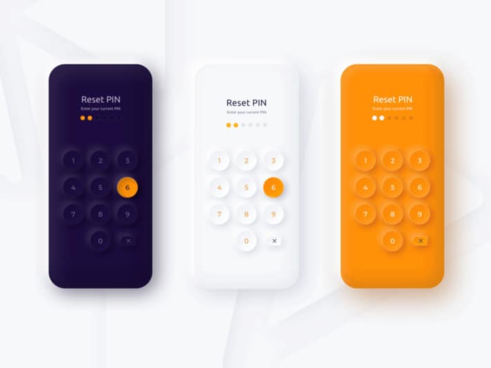
In 2020, Neumorphism gains immense trust. Now, it aims to take us into the paradoxical age of minimalist realism in 2021. The style came to replace skeuomorphism, a design approach that integrates renderings into existing designs of familiar, and obsolete materials. In the early 2010s, it earned prime and popularity on app icons everywhere.
#8 Abstract Shapes
Recently, abstract images tend to have a bigger role in website design strategies. Such elements tend to intrigue the visitors and evoke emotions, mimic, arise interest, and keep the audience interested.
Abstract elements may come across as very simple, minimalist, and restricting, especially those consisting of geometric primitives such as squares and circles. Web designers are expected to include them into complex, floating compositions that show liberty in 2021.
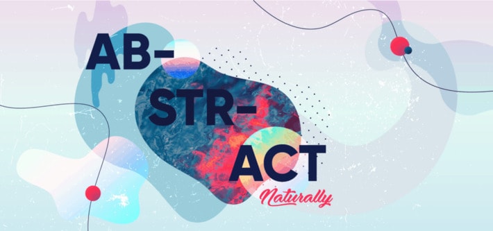
In the upcoming year, abstracts are going to be used as an alternate option for web design photography that is used by businesses, startups, and applications. Thanks to these objects a web page or a screen view may look very alive and arouse emotions even without showing a human face.
#9 White Space and Comfortable Colors
The days when we have websites full of information contained on a single page are gone. Nowadays, blank space is preferable as it makes it easier to navigate the page and find out the required information.
Besides, having spent a lot of time in front of computers, people usually experience eye strain. Considering this factor, web designers brought a new design trend, making use of comfortable colors that are easier on the human eyes.
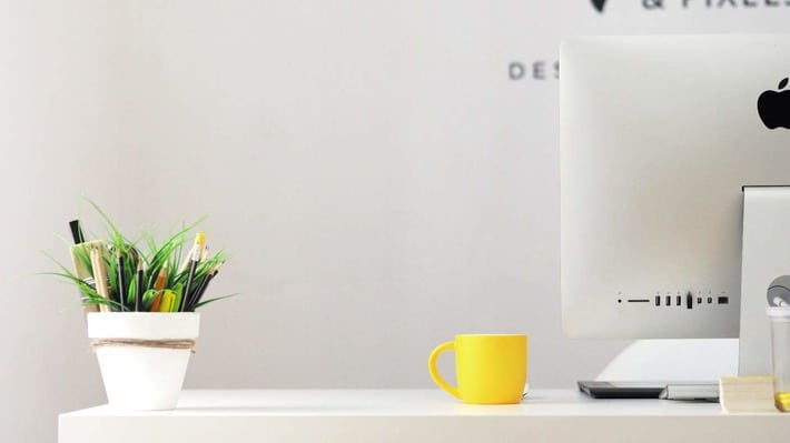
Some designers think this color is between dark and light modes we have already discussed. They offer a comfortable color scheme, taking into account the preference of some people who don’t like dark themes. This trend gives the priority to comfort over dramatism in innovation.
Ready for the biggest web design trends in 2021?
If not today, then tomorrow all these trends are going to be a part of our daily life. This fact once more proves that websites and other digital platforms are an inevitable factor in human life. Accordingly, businesses pretend to use these portals as a means to reach active and potential customers.
What may help to easily attract users rather than design? The answer is nothing. So, the most essential point to focus on is the design, the best time - right now. You are already familiar with the modern website design trends in 2021. Brainstorm ideas and find the best possible design that will arouse your users’ interest.
Hopefully, you enjoy the reading. If you have any concerns or just need to get some advice, then do not hesitate
Our team of experienced designers is always ready to discuss your specific business niche. Do not miss your chance to increase your success!

Автор։
Vera Mirzoyan
Опубликована։
Декабрь 09, 2020
Последное обновление։
Июль 28, 2021