
Top Professional Personal Website Design Trends 2019
How you present yourself, is how people perceive you. How you design your website, is how people identify your business.
Web design is undeniably the most influential feature of your brand. It provides the overall impression on your company, business or brand. Whenever searchers access any site, they may immediately leave it. The logic may be distinct.
Why do searchers leave websites immediately?
The reason people don’t stay on some websites differs. It may depend on the visitors’ preferences or your mistakes. The result is that both points come from lack of your site design professionalism; how it matters.
What are the Five Most Important Website Design Do’s And Dont’s You Should Consider
The process of designing a website isn’t an easy deal. There are many aspects to consider. The most essential is to do research and find out what kind of sites people prefer. Secondly, you should take into account web design do’s and don’ts. These are important rules for an attractive and functional design. Your mission is to design your website professionally and admire your visitors.
Your personal website provides information related to your company, business, service or product. Your visitors should find their required information with the least possible effort. If they don’t, they leave.
You don’t want to disappoint your visitors but make them satisfied. You want to design a website which will be more than people are looking for. To achieve your goal, go ahead. Find the top professional personal software design trends to consider in 2019 below.
#1 Responsive design
With the constant development of technology, people have a wider choice of devices. They access your site through mobiles, tablets, TVs, wearables, and desktops. Web designers can’t ignore this fact. One of the most crucial factors of an acceptable website in 2019 is a responsive design.
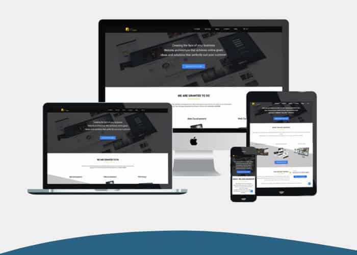
Even Google highlights responsive-design websites. They prioritize mobile-first indication. The site should be mobile-friendly. An attractive and functional website on the fullscreen computer is great. But it should never be less acceptable on other devices.
#2 UI/UX
UI and UX are an inevitable part of the IT sphere. Although both are integral, they stand for quite different processes. UI is the user interface, while UX refers to the user experience.
UX design is a relatively new field. It refers to people’s interactions with the product or service. Creating a UX means defining how a product/service is meeting the users’ needs. The most important to consider is that the UX should be clear and user-friendly. A rich UX simplifies website navigation. It is the main guide of the users.
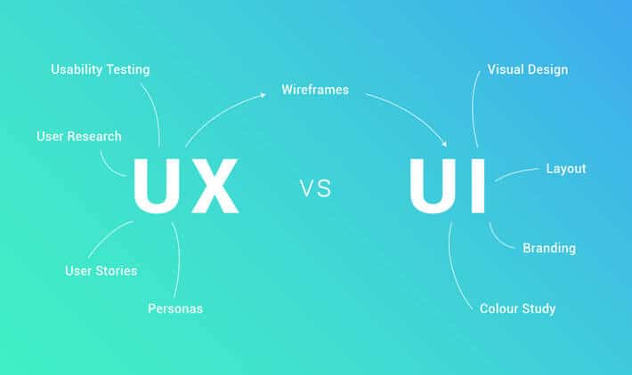
Image Credits: We Create
UI is something different. It includes all the buttons, controls, blocks, colors, and other elements on an application, or any page. A good UI is the visual impact of characters. It’s the first thing that attracts visitors and provides them with useful information. UI plays an essential role in the users’ decisions to stay on your website.
#3 Minimalism
Less is more. Minimalism is the art of less. In modern fast life, people lack time. This is the style of a classic design. A beautiful minimalistic design never wastes time. The main principles of this style in web design are: 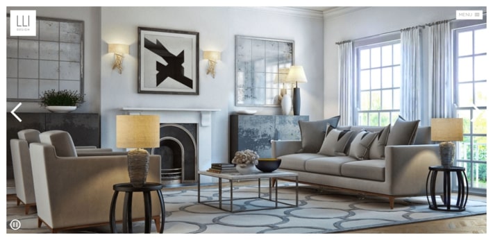
- user-friendly interface
- lots of space
- hidden navigation
- no extra buttons
- no excessive details
All these points make it possible to digest information. Yet, it requires the shortest possible duration of time. Minimalist websites have another advantage: they are easy to make responsive. In other words, minimalism does more with less. It is simple but never simplistic.
#4 Monochromatic color scheme
Sometimes people think that using lots of colors makes web design attractive. But it’s not what makes sense. Mixed colors make a mess. If there isn’t any tonal contrast, then there can’t be a pleasant design.
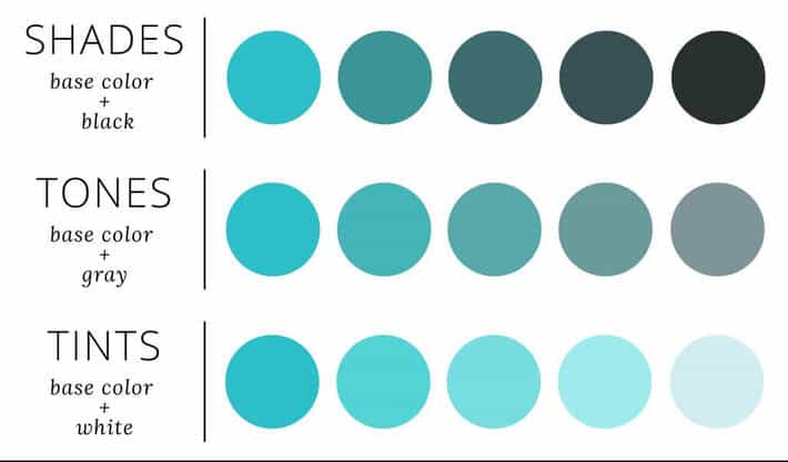
Image Credits: The UX Blog
Then what does matter? Nowadays the monochronic colors are more engaging. An attractive monochronic color scheme design makes the professional personal website memorable.
#5 Personalized illustration style
The illustration is what conveys meanings whenever standard photography is out of date. It transmits your brand message in a very creative way. This principle converts an ordinary website into something unique. According to statistics, the visual impact of such a decoration on users is 7 times better. It has the power to tempt users and make them potential customers.
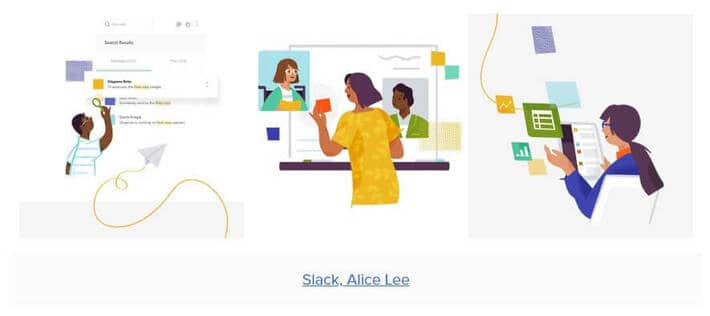
Personalized style of this design transfers brand characteristics. As a result, it becomes more memorable. This kind of visual communication is preferable; it’s better than abstract text or usual photos.
#6 Animation design
The animation is no longer just for cartoons. These kinds of techniques have become practical and efficient web design tools. It is trendy, fun, and at the same time user-friendly. Something created in a still form may move due to the animation tool. Like illustrations, animations also convey a specific message creatively and attractively. But if the previous factors are in photo form, in case of animations we deal with videos.
#7 Retro design aesthetic
In the modern world, investigations seem to have no limits. Many web designers try to create something new every time, but sometimes it’s impossible. And where is the solution?
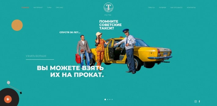
The new is well-forgotten old. An individual professional website may look great in retro design as well. A retro color scheme or photos in retro style fascinate visitors and evoke nostalgia. The time is repeatedly changing. Old design elements come back with a hint of nuance.
Sum up
Website visitors don’t take into consideration your efforts. They either appreciate an excellent software design or leave something inappropriate. Your website has three seconds to make an impression on your visitors. To get a personal, professional site, share your personal offers with professionals.

Автор։
Vera Mirzoyan
Опубликована։
Март 11, 2019
Последное обновление։
Декабрь 29, 2020


