How To Win The Competition With Travel Website Design
There is great competition in the travel industry as the number of travel agencies is increasingly growing. The fact that tourism websites are must-have tools for agents is out of the discussion. More often, the industry places an emphasis on the travel websites’ designs and appearance as a good-looking site hopefully draws more interest in the destination.
Regardless of the fact of whether you are a big or small tour operator, you know for sure that this online platform serves as a shop window, yet the time of shiny sales brochures and direct mail booklets have already gone. So how do luxury websites implement their travelweb to help the prospects achieve their traveling goals?
Once, I have already discussed the importance of an online presence for a tour agency. You may get familiar with the 10 reasons why travel agencies need a website. For this time, I’m going to focus on the significance of travel website design and the influence it has on potential travelers.
Let’s check out the most essential features!
#1 Attractive Design and Imagery
Beautiful design and layout help you expand the number of potential customers who look to spend their holidays at somewhere nice. The nice design is what attracts people and makes the first impression. As it is said, “You never get a second chance to make a first impression.”, your website neither!

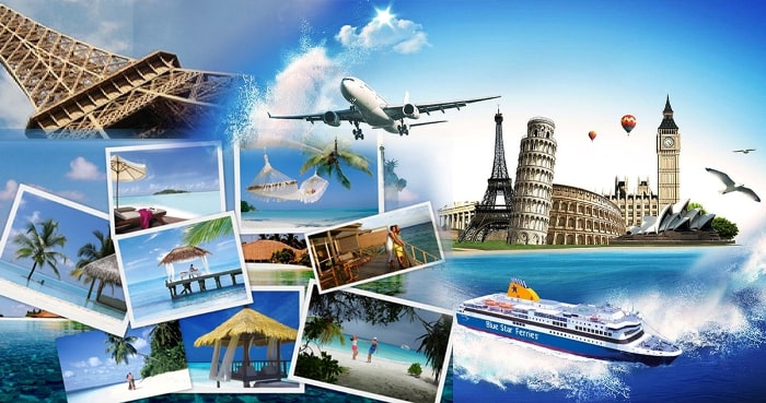
You should follow the website design trends and make sure your platform goes along with the modern tendencies so that it won’t disappoint the visitors. Include images that arouse interest and have a positive influence.
Ensure to choose good photographs, either for building an in-house photo library taken by previous customers, or your tour guides and during personal travel experiences, or by taking the advantage of great copyright-free imagery from platforms like Unsplash, Pexels, and Pixabay. Alternative paid image libraries are iStock or Shutterstock.
#2 Navigable Structure
Your website structure and layout are closely related to the site design. That is why you are highly recommended to form your travel aesthetic, imagine both the logical flow of information and also the way how visitors browse your site.
Your tourism website design must be easy to understand. It must be so clear that the visitors don’t have to scroll much to find whatever information they need. Each page, especially the home page, must be easily navigable so that no chance is left that the prospects will misunderstand anything, or you miss a single possibility of sales.

Besides providing a navigational experience, the website structure and layout are the keys to ensuring the visitors remain focused on the action you want them to take. For instance, Call To Actions. While working as a travel operator, a CTA is a structural feature that drives visitors to look into or book. The highest value of clean design calls to action.
#3 Simplicity
As a user experience professional - Steve Krug says, “Nothing important should ever be more than two clicks away,” or “Speak the user's language,” or even “Be consistent.” “When I look at a Web page it should be self-evident. Obvious. Self-explanatory. I should be able to “get it” - what it is and how to use it without expending any effort thinking about it.”
Maybe you try to introduce as much information as possible, to make sure your site visitors clearly get the point. However, what the travelers really need is a simple interface where they easily find deals for airline tickets, vacation packages, tour bookings, hotel room reservations, or car rentals. Don’t make your potential customers give up on your platform. Provide an attractive simplicity in your travel website design so that people freely orient without hard work and effort.
#4 Responsiveness
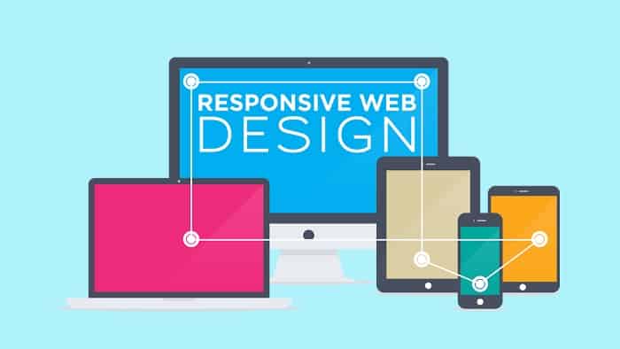
As I have already discussed in some articles, missing website responsibility is one of the web design mistakes you should avoid. With the development of technological devices, people tend to use the latest devices and your site design should be so mobile friendly that it provides great user experience regardless of the device used.

Your tour website design should offer a similar experience no matter on full-screen desktop or on mobile. People, especially travelers, are dependent on their smartphones and surf the Internet on their go. Either you provide a responsive platform and satisfy the visitors or lack in it and miss potential customers. Guess what you need?
#5 Custom Design
Personalizing your travel website improves interaction with customers as well as strengthen the relationship they have towards your brand. Some tour agencies prefer to use different templates to create an online platform for their business. They pay annual fees for having a template-based site that doesn’t have its custom design.
Imagine that potential travelers look for nice travel services and check out several tour agency websites. And what a surprise, your platform has the same template design as one of the competitors. You haven’t dreamt about this! What you need is a custom website design that represents your brand and creates the digital face of your travel business, according to your logo, colors, style, etc.
To Sum Up
An aesthetically beautiful, functional and informative travel portal is critical and may lead to the success of the tour business. Currently, the design and structure, that takes the responsibility for customer journey is what still needs a lot of attention.
You have already gotten familiar with the significant factors of the travel websites’ designs, due to which businesses win the competition and stay ahead of their competitors.
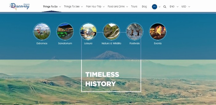
If you want I can bring a great example of an attractive travel website that evokes the attention of potential travelers and serves as a guide. It is Armenia Discovery - one of our successful projects that prompt business progress.

If you want to have a similar portal, do not hesitate to get in touch with us!

Автор։
Vera Mirzoyan
Опубликована։
Декабрь 18, 2019
Последное обновление։
Декабрь 15, 2020

