5 Important Website Design Do’s And Dont’s to Consider
If you want to create a successful website, you may not know from where to start. Your website should be both useful and attractive. Before you begin designing your website, consider some principles. It makes a big difference in your site look and performance. Below check five do’s and dont’s of website design. Follow these principles and make smart decisions about your website.
Five website design DO’S
1. Make it easy to scan your page
When visiting your website, users try to find the information they need. They scan the site instead of reading everything in detail.
Your design should highlight the fundamental factors of your business. And also sort out the visual hierarchy. So, the arrangement of the site helps your visitors decide what point focus on the first, second, and so on.
2. Design easy-to-use navigation
Help users to find the information they need with the least efforts (clicks). Your website navigation should be simple, clear and consistent.
The site should have the most straightforward structure and be visual for visitors. The navigation system for the home page should be the same on every page. With the help of a good navigation system, visitors orient where they need to go.
3. Change the colours of visited links
Links with changed colours prevent your customers from revisiting the same page. At the same time, visual past and present locations lead visitors the next step.
4. Provide a similar experience, regardless of the device

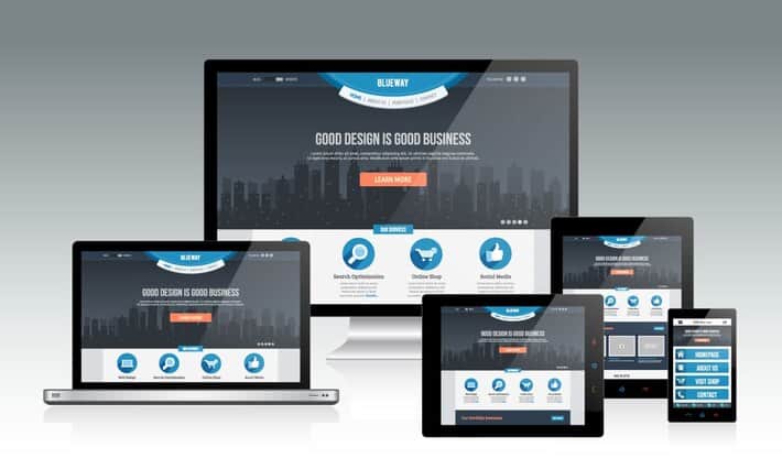
Visitors come to your website using different types of devices. They prefer to get the same result no matter whether they use a laptop, tablet or phone. Ensure that your site looks and functions as high on a full-screen laptop as on any other device.
5. Create your website colour scheme so that it goes well with the content
The color matters. While choosing the tone of your website find the impact of colors. Never use a combination of your favorite ones.

Colors have a psychological effect on visitors, which influences their experience. Read about the theory. Find out how different shades work with each other.
Make sure that the combination corresponds to your content. Make a smart tonal combination structure that enhances your content. Take into account the fact that colors have different meanings in different cultures. Consider your target visitors’ cultural beliefs as well.
Five Website Design DONT’S
1. Make your visitors wait for content to load
Waiting for your website to load makes visitors frustrated, and they may leave the site if it doesn’t load fast. When the loading takes too long, even the most attractive loading indicators don’t help.

So, make the website faster for your visitors in order not to presume their tolerance.
2. Open internal links in new tabs
This function is like a rude behavior that disables the Back button. It may cause misunderstanding for visitors about how to return the previous page.
3. Let ads be the majority
An overwhelming amount of advertisements shadow the content.

It distracts users' attention from getting what they need. Users usually ignore such kind of ads. These are promotions that make the process of focusing on the main points much tricky.
4. Let auto-played videos with sound
Auto-played videos, sound,s or music in the background irritates visitor and makes them anxious. Use these elements in case they are appropriate to your content and users expect it.
5. Bombard the visitors with content
When you overcrowd the website with information users feel in a mess. In this case, you lose the excellent content because of an untidy structure.

Include some blank spaces without any content on the screen. Air your site and don’t prevent your visitors’ visual impact. If your visitor gets an extreme amount of data at once, he/she cannot avoid missing out on something.
Keep in mind these principles, and I guarantee the performance of your website. The success of your site is the success of your business. Go ahead!

Автор։
Vera Mirzoyan
Опубликована։
Декабрь 19, 2018
Последное обновление։
Декабрь 30, 2020